Touch Button Layout View
Sites > Look and feel > Touch button layouts > Select a touch button layout
What is the view used for?
- In this view you can preview and edit the touch button layout for the POS.
- Use the Touch button layout to design your POS. We recommend that you take a look at the demo data to get some idea of how the touch button layout works.
- Create the button grid menus and assign them to the touch button layout.
- Open Touch button layout and open the "Change design," drag and drop the parts into the touch button layout.
- Click on the Save button.
 Touch button layout header fields
| Tab/Field name | Description |
|---|---|
| ID | Displays the ID number of the touch button layout. |
| Description | The touch button layout description. You can edit this in the text box. |
| Button grid menus |
Clicking on this opens the Edit touch button layout dialog, where you can add or edit button grid menus that are available in the customization window. In our demo data, we have three button grids selected for the store "Supermarket," Operation Selection (Button grid 1), Main Operations (Button grid 2) and Supermarket PLU Main (Button grid 3). There are five button grids available. In its set up, the Open Menu, Operation Selection is attached to menus that are assigned to button grid 2. Main operations is just one of the menus that are assigned to a button in Operation Selection, so it is chosen to be the menu that appears on default when you open the POS. The Supermarket PLU Main is a Submenu, a layered menu that opens other menus in the same button grid. |
 Change design Change design |
Clicking on this button opens the customization window from which you can drag and drop objects into the touch button layout. |
Customization dialog
Layout objects
In a new layout when the change design link is clicked or the design area is right-clicked and Customize layout selected this dialog opens. The dialog includes a list of all objects that have not already been added to the opened touch button layout.
Use the four buttons at the top to:
 – open a folder to...
 – save the...
 – undo the change made in the object setup.
 – redo a change that has been undone.
Below is a list of all the objects available with a description.
| Tab/Field name | Description |
|---|---|
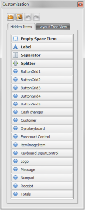
| Hidden Items Tab | Click on an Item on the list, hold it and drag it into the touch button layout and drop into a Space on the layout. |
| Empty Space Item | |
| Label | |
| Separator | |
| Splitter | |
| ButtonGrid1 | Drag this button grid menu to the layout to show the button grid selected for Button grid 1 in the button grid menu setup. |
| ButtonGrid2 | Drag this button grid menu to the layout to show the button grid selected for Button grid 2 in the button grid menu setup. |
| ButtonGrid3 | Drag this button grid menu to the layout to show the button grid selected for Button grid 3 in the button grid menu setup. |
| ButtonGrid4 | Drag this button grid menu to the layout to show the button grid selected for Button grid 4 in the button grid menu setup. |
| ButtonGrid5 | Drag this button grid menu to the layout to show the button grid selected for Button grid 5 in the button grid menu setup. |
| Cash changer | |
| Customer | |
| Dynakeyboard | |
| Forecourt Control | |
| itemImageItem | |
| Keyboard InputControl | |
| Logo | |
| Message | |
| Numpad | |
| Receipt | |
| Totals | |
| ButtonGrid1 | There are five button grid menus. Select the button grid menus that you want have assigned to the relevant menus. If you right click on the button grids on the layout, you can open the “Button Properties” dialog or clear a button from the menu. |
| Cash changer | |
| Customer | This part displays the customer in the transaction on the POS. |
| Dynakeyboard | |
| Empty Space Item | Use this to place an empty space in the touch button layout. |
| Forcecourt Control | |
| ItemImageItem | |
| Keyboard InputControl | |
| Label | |
| Logo | Insert the logo panel. The logo can be chosen in ... |
| Message | The message panel, this displays any messages on the POS. |
| Numpad | The number pad, this is used to enter numbers in the POS. |
| Receipt | The receipt panel, this displays the sales lines and totals. |
| Separator | Use this to separate areas in the touch button layout. |
| Splitter | Use this to split areas in the touch button layout. |
| Totals | The totals panel that displays the totals: Total discount, Subtotal, No of item lines, Tax, Payment, Balance. |
| Layout Tree View | |
| Column editor |
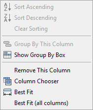
Choose columns to display in the receipt panel by right clicking in the header line to see the option “Column chooser,” selecting this opens the Customization window for the column chooser.
|
| Sort Ascending | Sort column A to Z. |
| Sort Descending | Sort column Z to A. |
| Clear Sorting | Clear sorting settings. |
| Group By This Column | |
| Show Group By Box | |
| Column Chooser | Select this option to choose parts for the column. |
| Best Fit | Resize the selected column so that it fits well in the receipt panel. |
| Best Fit (all columns) | Resize all of the columns so that they fit well on the receipt panel. |
| Column Customize window |
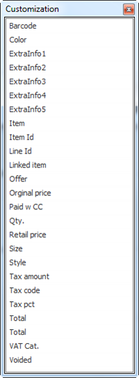
Drag and drop these parts into the receipt panel header to add the column. Drag and drop them outside of this area or back into the Column Customization window to get rid of them from the header.
|
| Barcode | The item’s barcode. |
| Color | The item’s color. |
| Extra Info | Extra information about the item, you can set this… |
| Item | The item name. |
| Item Id | The item ID. |
| Line Id | The line ID. |
| Linked item | Any linked items. |
| Offer | An offer. |
| Original price | The original price of the item. |
| Paid w CC | |
| Qty | The quantity of the same item. |
| Retail price | The retail price. |
| Size | The item’s size. |
| Style | The item’s style. |
| Tax amount | The tax amount on the item. |
| Tax code | The tax code. |
| Tax pct | The tax percentage. |
| Total | The total. |
| VAT Cat. | The Value Added Tax Category. |
| Voided | Display voided items. |
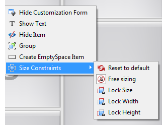
| Change Design is open, Right-click on area. |
|
| Hide Customization Form | Selecting this closes the customization form. |
| Show Text | Click on a panel and add text next to it, this opens the option “Rename” which allows you to change the text. This appears on the POS. |
| Hide Item | Click on an area to remove from the Touch button layout. |
| Group | |
| Create EmptySpace Item | Insert an empty space area. |
| Size Constraints |
|
See also
| Last updated: | September 2017 |
| Version: | LS One 2017.2 |

